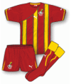
 Where Algeria, Cameroon, Ghana and Ivory Coast are concerned, the home strips are smart, sleek, rather minimalist in their design and all the better off for it. Each of the shirts in question also have a unique feature of a panel on the right shoulder which have a shadowy logo – typically something associated with the relevant country. For Ghana it's the star which features on the country's flag, Ivory Coast have an elephant's head, Cameroon have a lion's head and Algeria have the head of a desert fox. A nice distinctive touch and one which Puma should be very pleased with.
Sadly the shoulder panel motif isn't carried through to the away shirts, but they've been given a theme of their own, namely 'stripes and hoops'. And what an impact they have. Algeria's green change shirt has a series of thin double-stripes in red and white which, when inspected at closer quarters, have a hand-painted look which is quite cleverly done. Cameroon's yellow away shirt takes a similar approach with single 'hand-painted' red lines.
 When you get to Ghana's away shirt, however, things start to get a little crazy. In the past, Ghana have worn plain yellow to complement their white for home matches, but this year Puma have given them a shirt that’s red with thick yellow stripes, each one flanked with thin 'hand-painted' green lines. It is, to say the least, bold and ever so slightly garish.
Finally to the Ivory Coast and their away shirt looks more akin to a rugby outfit than anything else. It is predominantly green with thick white 'hand-painted' hoops, each of which is flanked with thin orange lines. The whole 'hand-painted' thing is very well executed indeed, although in all honesty it's very difficult to pick up on the work that's gone into the design if you're seeing the shirt from any more than 10 metres away. No matter – it shows someone's actually used a bit of originality at the drawing board stage.
It's not all about Africa though. Puma also have Italy, Switzerland and Uruguay on their books for this World Cup, and for each one they've taken a very modest design and added some flashes here and there in a contrasting colour to break things up a bit but not too much. Quite nice, but nothing as distinctive as was seen with the African countries mentioned previously.
Oh, but there was one other thing – the Italian home shirt has a huge shadow design on it which looks rather incongruous and, well, to be honest, we're not sure what it's supposed to be. Needless to say it's been likened to a robot's rib cage and that's probably good enough for us. It also forms part of an all-blue Italy strip which we don't often see but looks very imposing nonetheless.
Overall then, some particularly good work by Puma on those African kits while the others are just 'alright'. Nothing quite as wacky as Puma's former controversies like the sleeveless Cameroon shirt, but that's just as well. Us fans like originality, smartness and style in our kits, and that's pretty much what we've got here.
Coming soon: Part 4 - Umbro's kit's all-white, plus any other business
Our great thanks go to John Devlin from True Colours Football Kits (www.truecoloursfootballkits.com) for the use of his excellent football kit graphics. To see all of John's World Cup kit designs in greater detail, click here.)


2 comments:
Aren't there 6 teams from Africa?
Only if you include Nigeria... ;-)
Well spotted and apologies for that Andy G. Had a bit of a blind spot there... The article's now been amended to show what I should have said. :)